ABODE
Project Overview
Designing visual identity and brand strategy.

Tools
Role
Designer Web Designer
Project Duration
ABODE – A Luxury Accommodation Brand
Website under development
Client Overview:
"ABODE" is a luxury accommodation brand catering to discerning travelers seeking unique, high-end experiences. Positioned in both bustling urban centers and serene, exotic locales, ABODE aims to offer unparalleled comfort, sophisticated design, and personalized services that create true to location experiences.
Objective:
The goal was to craft a visual identity that encapsulates the brand's core values: harmony, art, luxury, and simplicity. The identity needed to be distinct yet versatile, resonating with a global audience while setting ABODE apart in a competitive luxury market.
1. Research & Discovery
Market Analysis:
The design process began with a thorough analysis of the luxury accommodation sector.
Modern and Clean Aesthetics: Brands favored sleek, uncluttered designs, often employing minimalist logos and contemporary typography.
Neutral Color Palettes: Predominantly black, white, greys, and pastels. Sometimes with metallic accents to convey a sense of refinement.
Brand Essence:
From the research, the team defined the brand essence into four core values:
Luxury: High-end, with an emphasis on quality and exclusivity.
Simplicity: Clean, modern design that is elegant without being overly ornate.
Modernity: A contemporary aesthetic that appeals to a global, urban clientele.
Harmony: An environment that provides a calm, tranquil escape from everyday life.

2. Concept Development
Mood Boards:
The design team curated mood boards exploring different visual directions. Three primary themes were identified:
Logo Concepts:
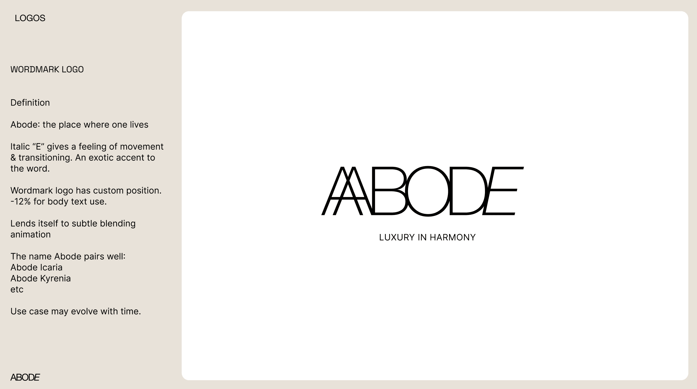
Wordmark: A simple, bold use of the ABODE name in Helvetica Neue, with subtle customizations to enhance uniqueness and memorability.
Monogram: A minimalist monogram created by artistically merging the double "A" from the brand name, offering a more exclusive and recognizable mark.
3. Refinement & Feedback
Client Review:
The client’s feedback included:
Logo Preference: The wordmark with subtle customizations in Helvetica Neue was favored for its simplicity and modern feel.
Color Palette: A monochrome palette with hints of warm beige was preferred, balancing modernity with a welcoming warmth.
Typography: The choice of Helvetica Neue was well-received, reinforcing the brand's modern, global appeal.
4. Visual Identity
Logo:
The final logo is a wordmark featuring the brand name "ABODE" in Helvetica.
Typography:
Helvetica Neue was chosen as the primary typeface due to its clean, modern aesthetic, which aligns with the brand's values of simplicity and modernity.

5. Implementation
Collateral Design:
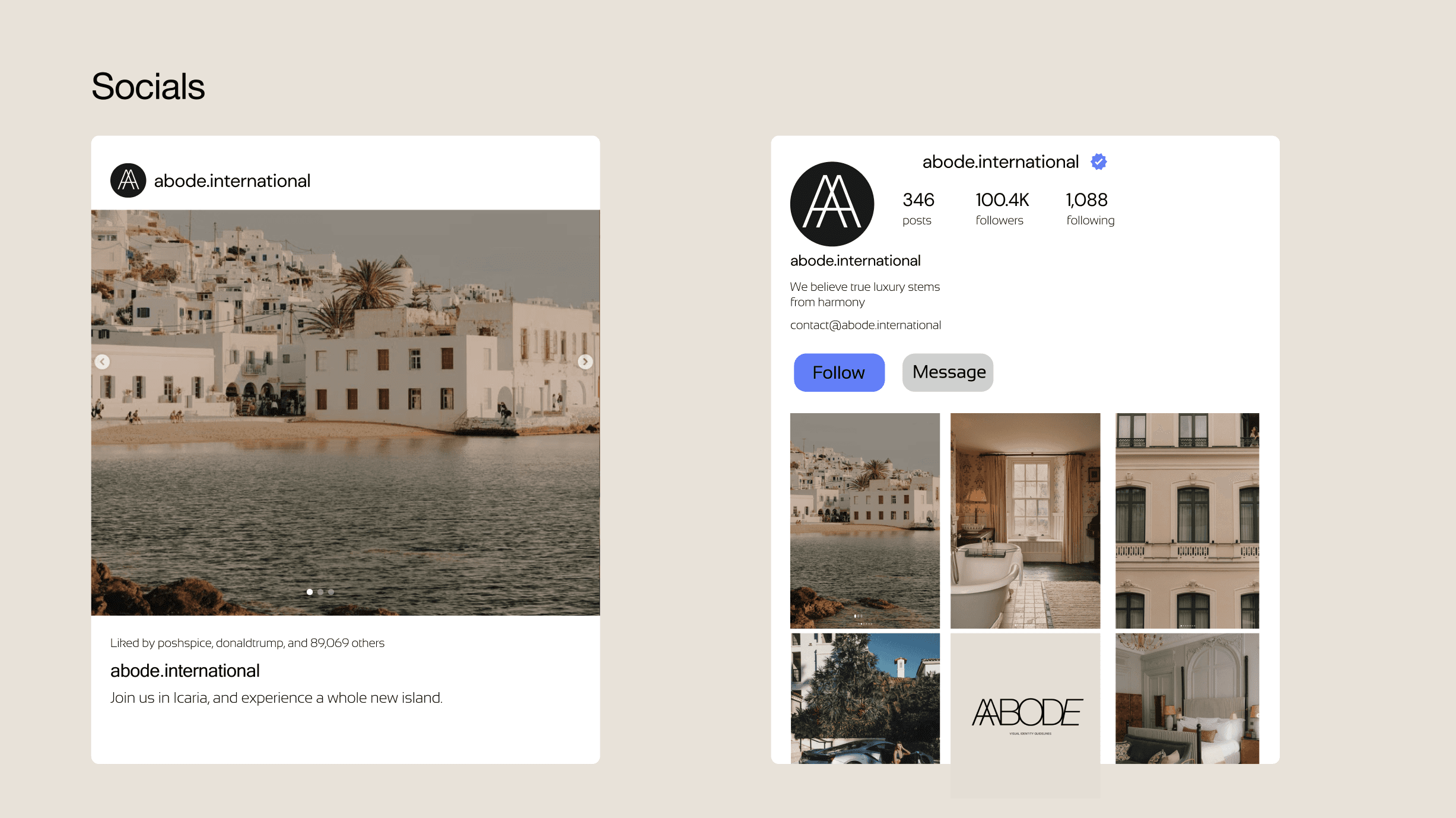
Website: A sleek, user-friendly website design that mirrors the brand’s minimalist, luxurious aesthetic, with an emphasis on high-quality visuals and easy navigation.
Signage: Interior and exterior signage that uses the wordmark prominently, crafted from premium materials like brushed metal or etched glass.
Marketing Materials: Books, brochures, digital ads, and social media templates designed to maintain the brand’s clean, modern look while effectively communicating its value proposition.

Obstacle: Implementing a Design System
Booking System: Using a booking API
Signage: Interior and exterior signage that uses the wordmark prominently, crafted from premium materials like brushed metal or etched glass.

Conclusion
The visual identity for ABODE acts as an umbrella to the narrative behind each property. The design's intention being a subtle homage to the elegance of each abode, and a complement to the detail of each project.